Tailwind EMEA Brand Refresh
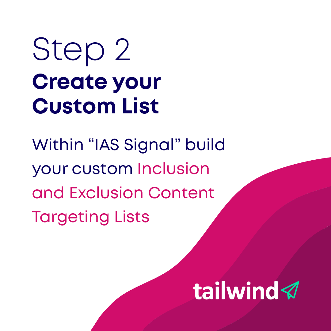
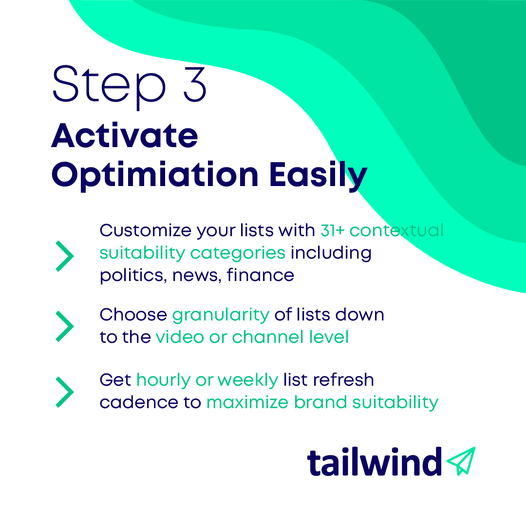
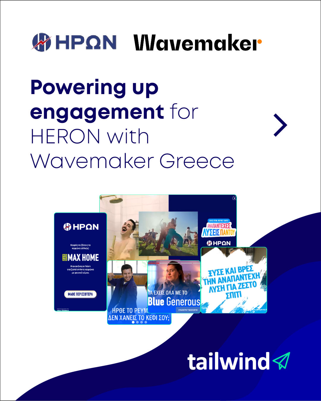
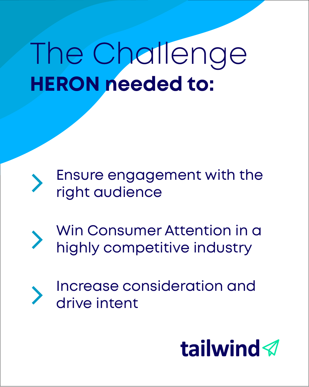
A focused brand refresh for Tailwind EMEA, extending an updated logo into social media, presentations, and print.
The Challenge
Modernise Tailwind EMEA’s existing identity while retaining its recognition. The brief called for an updated logo and a practical set of templates that would bring consistency to the company’s everyday marketing and sales communication.
The Role
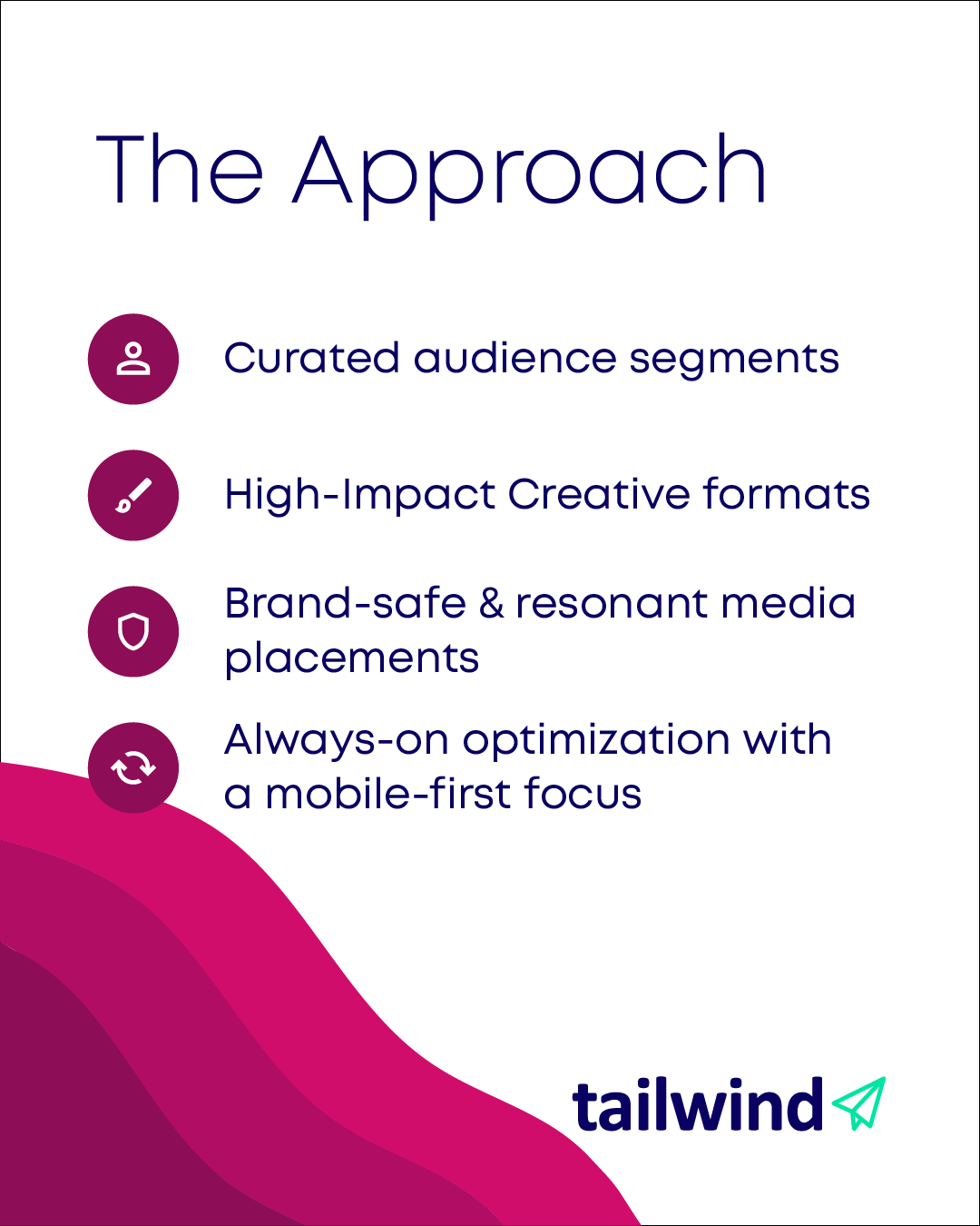
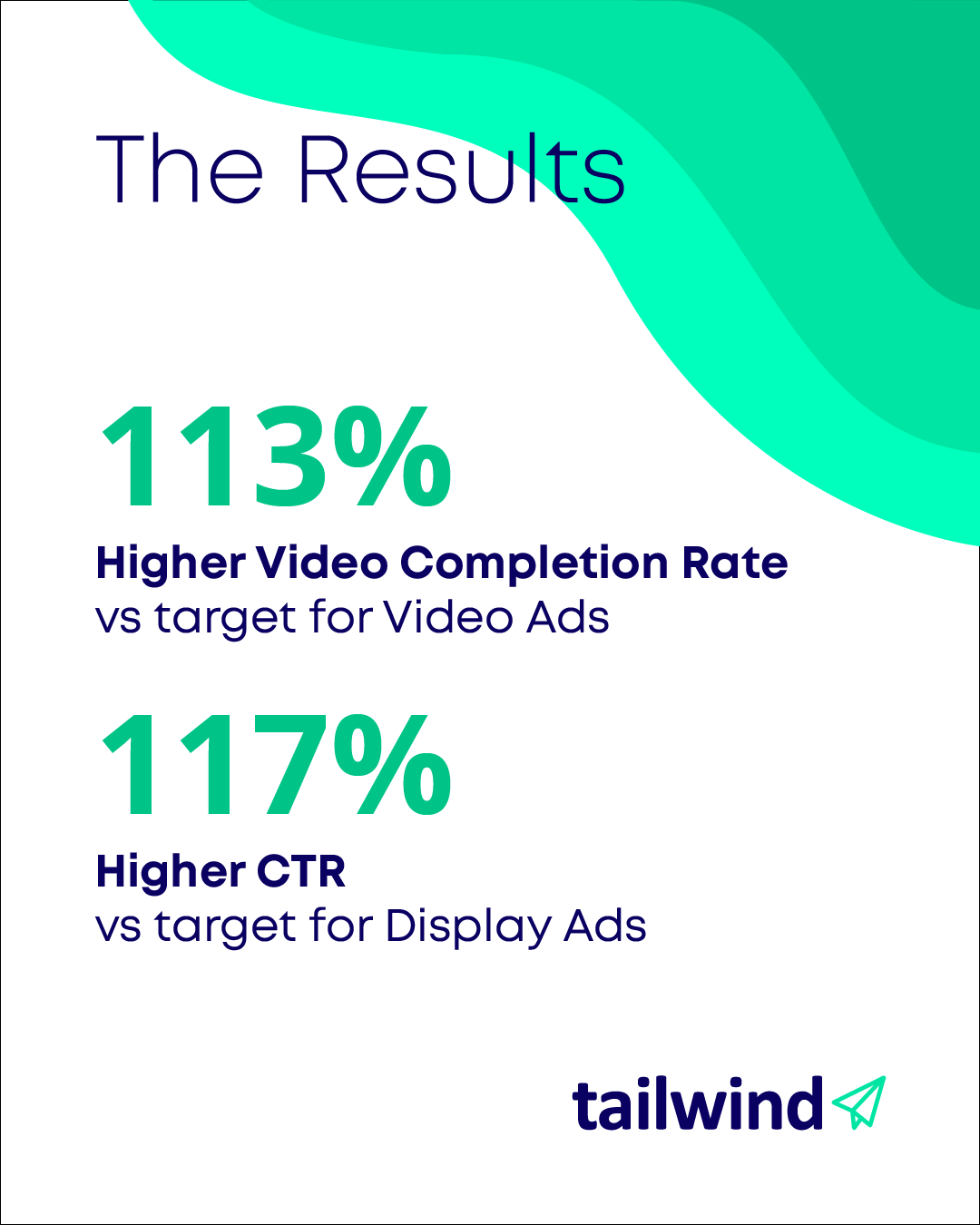
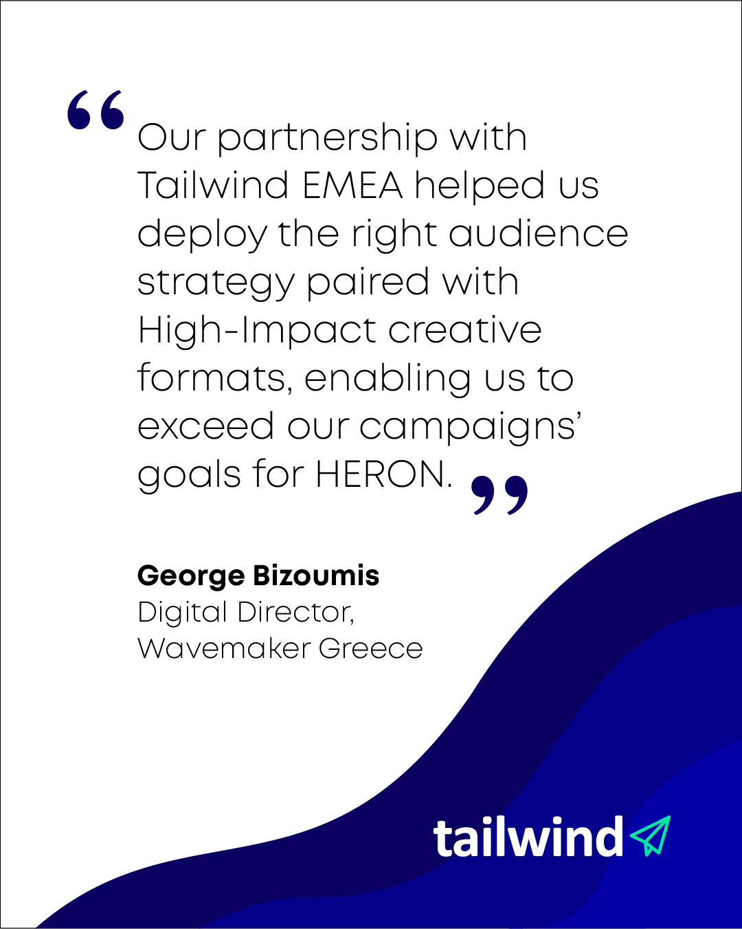
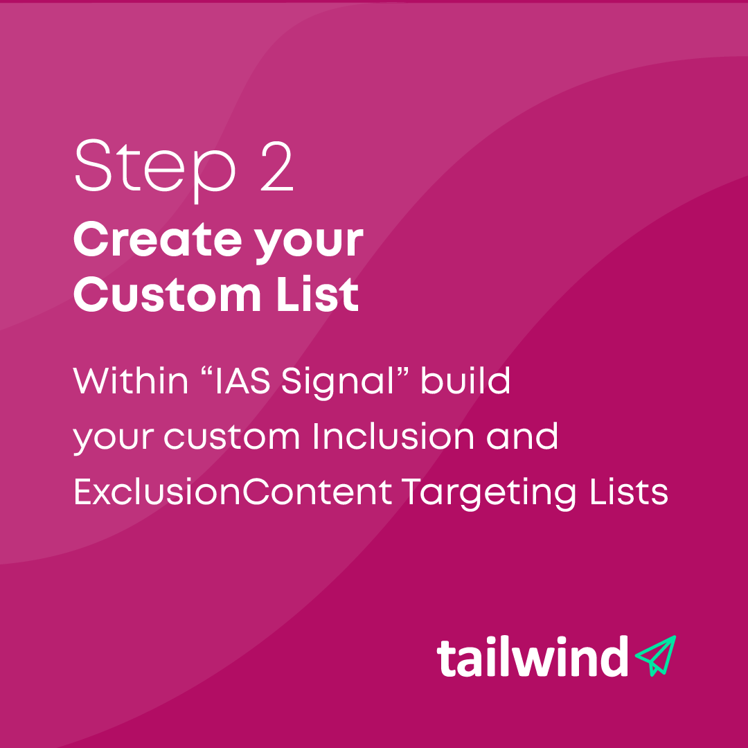
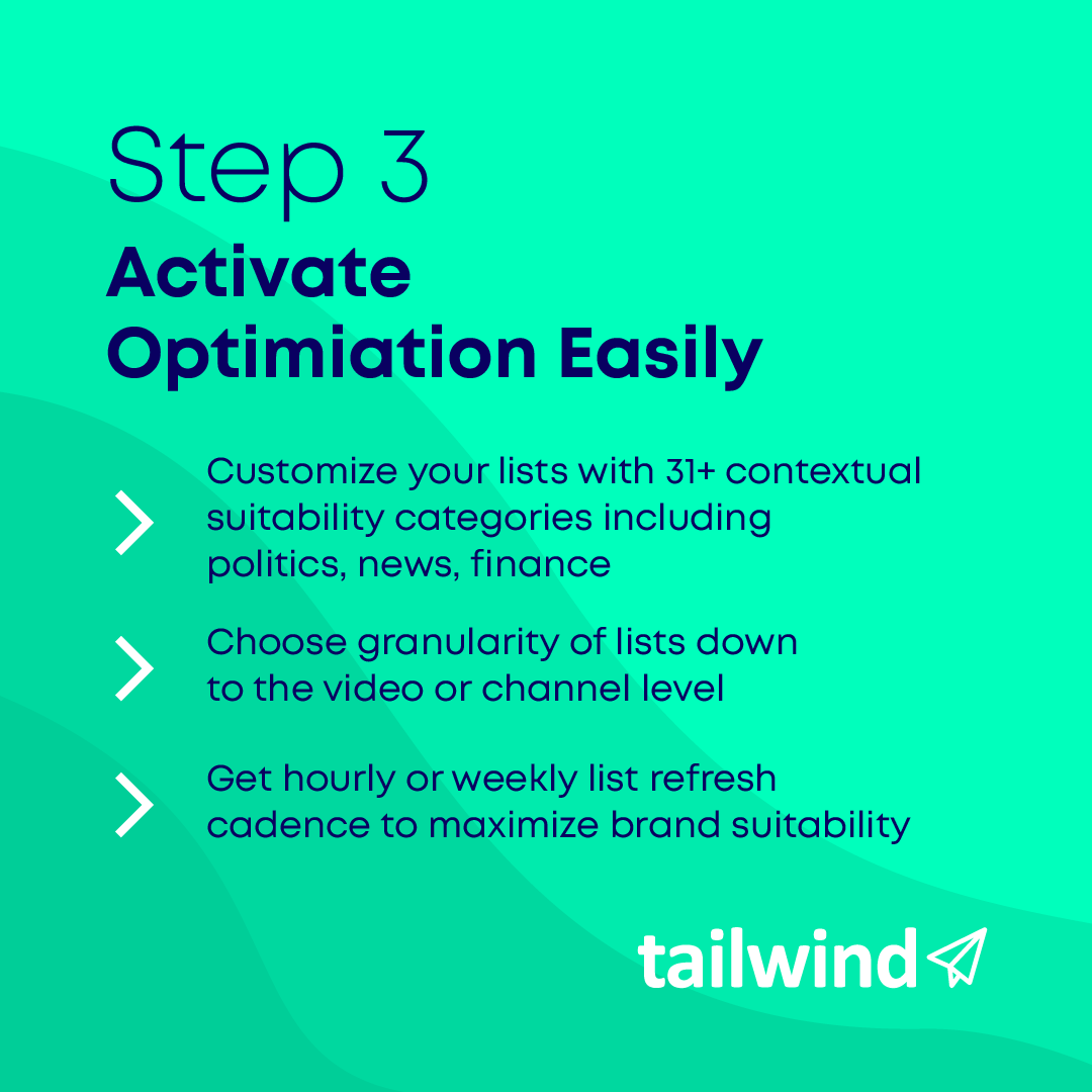
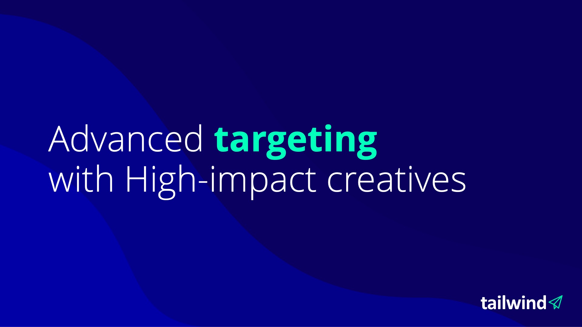
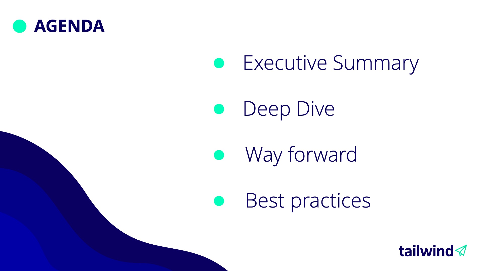
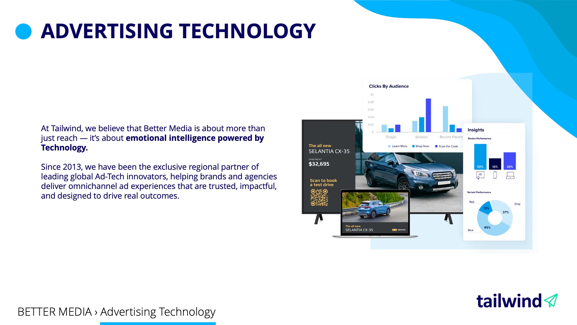
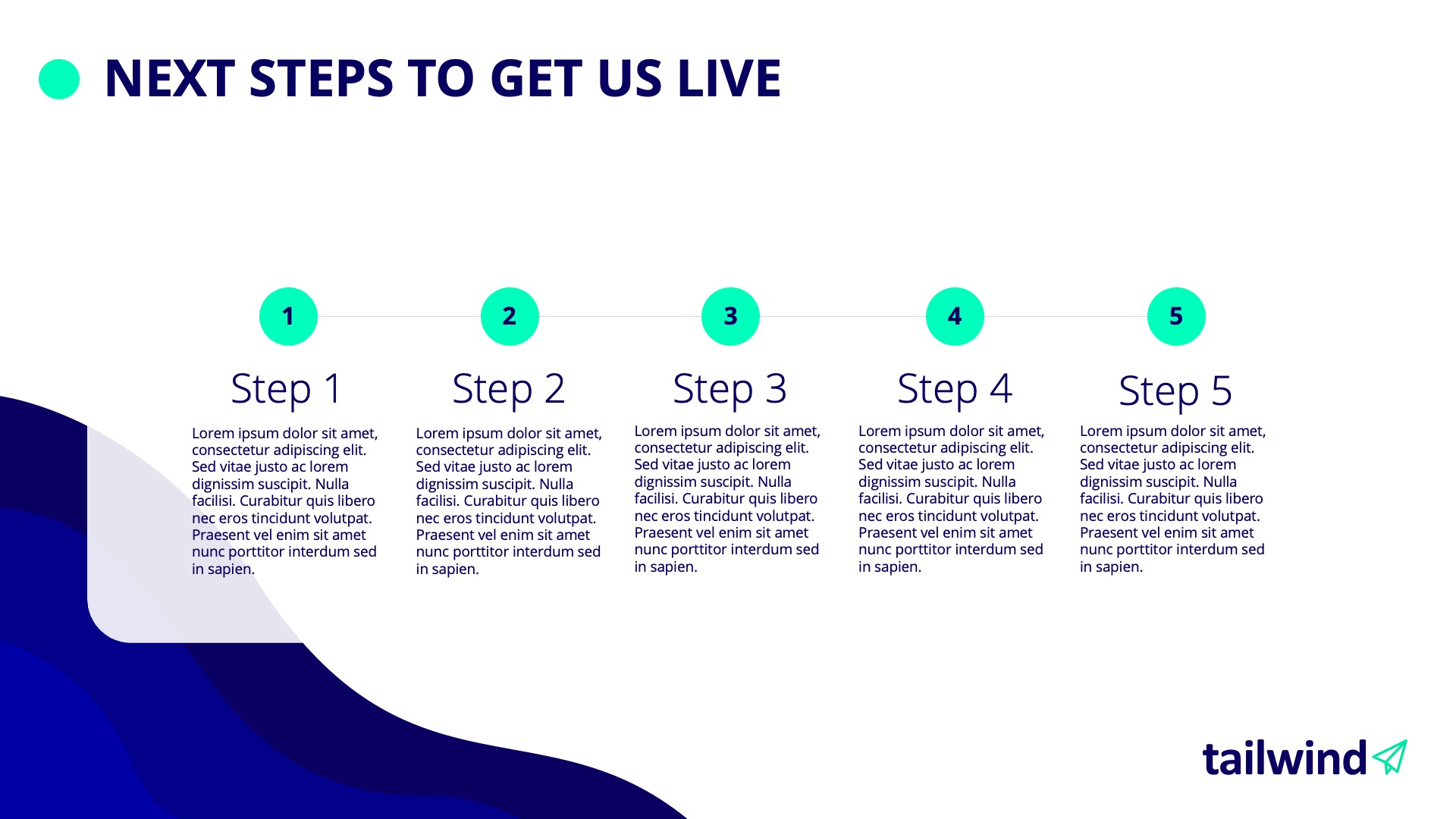
I refreshed the logo and developed the colour palette, typography, and visual language through the design of the templates. I created two social media proposals, each covering carousel, case study, and interview formats, and designed a family of wave graphics supplied as standalone assets. I also adapted the company’s sales deck into a PowerPoint template with reusable master layouts and refreshed its business cards.
The Outcome
The deliverables carry the refreshed identity across digital communication, sales presentations, and print. A unified deep-blue wordmark and mint outline symbol update the logo, while layered waves and a broader supporting palette connect the applications. Reusable social formats and PowerPoint layouts give the team a consistent starting point for creating new material.